If you’re in the market for data visualization, you’re likely torn between the two most powerful tools, Tableau vs Klipfolio. Both are great and choosing one feels like picking between pie and cake—but which one satisfies your specific cravings? They’re equally heavy hitters in the world of data, however, like any decent rivalry, they both have their own strengths and weaknesses.
So, which ones should you bring to your data party? In this comprehensive comparison, we discuss how these data visualization tools can help your business in their unique ways. Klipfolio takes the lead when it comes to real-time personalized dashboards, making it suitable for any business size. Tableau, on the other hand, is a cool and sharp tool for those who are exploring their options. But there’s more beyond this, and we’ll help you figure that out by the end of this post.
What is Tableau?
Think of Tableau as that genius buddy who makes you feel a bit dumb when they’re explaining something. It has built a reputation for its capabilities to handle huge amounts of data sets and come up with beautiful, interactive visualizations. It’s a global leader in the world of data visualization, relied upon for business intelligence and analytics, according to Gartner Magic Quadrant.
Tableau finds favor among business intelligence teams and data analysts because of its ability to connect to nearly any data source. Whether it’s Excel or SQL database, it can connect pretty fast and can transform data into slick dashboards. Regardless of the industry or role, it equips anyone with all they need to quickly analyze data.
What is Klipfolio?

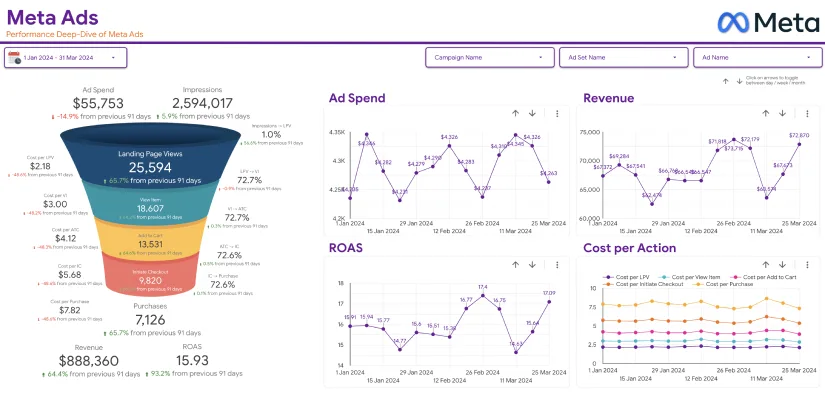
Klipfolio is your cloud-based friendly neighborhood data pool, built to make data visualization simpler and more accessible. It’s packed with features that make it the perfect choice for business and marketing teams without an advanced data science degree.
If Tableau is the Ferrari of dashboards, think of Klipfolio as the reliable, easy-to-drive sedan. It gets you from point A to B with just enough bells and whistles to get your passengers excited. But that doesn’t mean it doesn’t put up a fight when compared to Tableau. It can also manipulate complex data using a powerful data transformation engine.
With its predefined connectors, Klipfolio can also link to multiple data sources to make your data importation process easier.
Tableau vs Klipfolio: How Do They Compare
From the brief intro into this Tableau vs Klipfolio comparison, you probably already got a feeling of what each tool is capable of. However, you’ll be able to get a clearer picture after we compare them on some of the data visualization features.
1. Ease of Use
In terms of ease of use, Tableau ranks as a pro-level software, offering a steeper learning curve for its power. You won’t master it overnight because of its complexity. In fact, depending on how quick you are at assimilating knowledge, you might need several YouTube tutorials to understand it. Then go ahead and do some trial and error, and maybe a strong cup of coffee by your side.
However, once you get the hang of it, you can create mind-blowing visualizations with Tableau. It’s a perfect tool for data nerds who want to dive into analytics and craft intricate reports.
On the other hand, most people who are just getting started with data visualization find Klipfolio beginner-friendliness quite convenient. It doesn’t require you to spend weeks on courses to get started. Plus, it offers a more intuitive interface, while the platform comes with pre-built templates to make your work even easier.
Klipfolio can also easily integrate with tools such as Google Analytics, Facebook Ads, and more. It will fit you best if you’re a small business owner or a marketing manager looking to keep tabs on KPIs without the fuss.
2. Data Visualization: Who Does It Better?

Tableau vs Klipfolio: which one excels at visualization? If your goal is to get a tool that does best in data visualization, there’s no doubt that Tableau takes the day. It offers sleek visualizations that can be customized to the tiniest bit. Are you thinking of a dashboard with real-time data in a stunning 3D display? Tableau’s got your back.
It also has advanced analytics features such as statistical summaries and forecasting to make your reports beautiful and insightful. Tableau also supports drag and drop, allowing you to build stunning views within minutes once you connect your data source. Through the “Show me” feature, you get intelligent suggestions of suitable charts for the selected dimensions and metrics.
Klipfolio doesn’t keep up with the level of sophistication in Tableau. But it excels at giving clear, functional views of your data, minus the artistic flair. It has clean and efficient visualizations to do the job just right. But if you’re looking for a way to dazzle your clients or stakeholders with spectacular visualizations, it might not get you there.
3. Integration Capabilities: Who Plays Well with Others?
When working on a project, you most likely want the flexibility to import data from other third-party sources. Well, integrating with other tools is one of Tableau’s superpowers. Think of any source of data under the sun, Tableau can integrate seamlessly with it. From spreadsheets, SQL databases, and cloud services, to big data platforms like Hadoop.
It’s the ideal data visualization tool for organizations that handle multiple sources of complex data and need to consolidate everything in a single place.
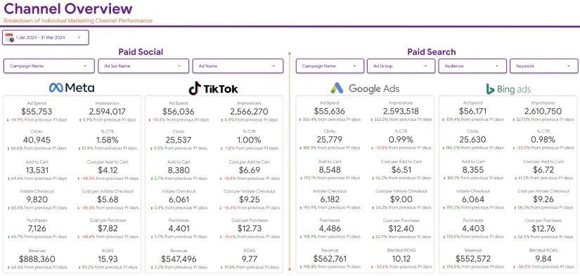
Klipfolio also does a wonderful job in terms of integration with third-party sources of data. It can seamlessly connect to more than 500 data sources, including Google Analytics, Xero, HubSpot, Excel, SQL databases, and more. Klipfolio is designed to suit the needs of business owners and marketers. A good number of supported integrations are tailored to meet the requirements of small teams with simple data sets.
4. Data Monitoring and Sharing

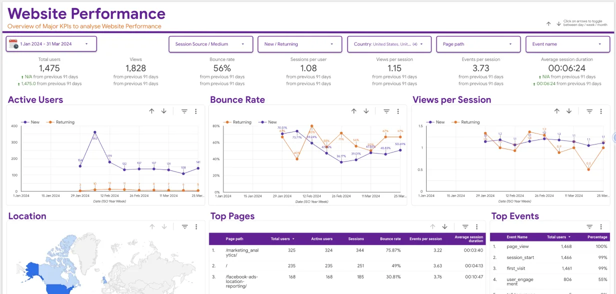
Tableau excels in creating interactive, real-time dashboards within minutes, even if you don’t have the technical expertise. Plus, once you’ve created and shared the dashboard, the end user can edit it and add their own views. This flexibility makes it a powerful tool for exploratory purposes and ad-hoc analysis.
In Tableau there are several ways to share dashboards with end users. You can use the tool’s complimentary solutions such as Tableau Server or Tableau Online. Or you can share it as a file and the end user can use a Tableau Reader to open it.
As for Klipfolio, it possesses just enough capability to allow you to create beautiful dashboards while guiding you to achieve responsible design. Its dashboards are mobile-responsive, making it more user-friendly to smaller teams always on the move. Once created, you can share the dashboards via email or as images and PDFs. Klipfolio also supports embedding individual widgets to blogs or websites so end users can view and interact with the dashboards.
Klipfolio dashboards also come with access control to restrict user view of protected data. This and several other reporting features make this tool suitable for standard users.
5. Pricing: Where Do Your Dollars Go?
Another important part of this Tableau vs Klipfolio comparison is pricing differences. Tableau being a premium tool, you’d expect its pricing to reflect its capabilities. It comes with individual plans for as low as $75 per month per user and enterprise solutions that cost up to $115 per month per user.
Even though it’s an expensive investment, you get what you pay for—a powerful industry-leading platform robust enough to handle the most complex data visualization needs.
On the other hand, Klipfolio offers more pocket-friendly plans than Tableau. It offers a 30-day free trial option for up to two users with features such as data warehouse integration, PowerMetrics AI, customizable dashboards, and more. The professional plan goes for $300 per month with plenty of powerful features to support up to 10 users. If you need a customizable enterprise plan with an unlimited number of users, you need to contact Klipfolio for a personalized quote.
Which one To Choose Tableau vs Klipfolio

When it comes to settling for one data visualization tool between the two, it all depends on what you need the tool for.
When To Choose Tableau
Here are a few conditions that make Tableau the most suitable visualization tool for your business:
- Advanced Analytics: Tableau’s advanced visualization and integration features make it ideal if your business dreams and breathes data.
- Customization: The sheer level of dashboard customizations offered by Tableau is on another level.
- Big Data Handling: If your business deals with large and complex data sets, Tableau can best manage it without breaking a sweat.
Tableau is suitable for large enterprises, data analysts, and businesses that rely on powerful highly customizable dashboards.
When To Choose Klipfolio
Klipfolio’s simplicity makes it a suitable data visualization tool for businesses that are after:
- User-friendliness: Every feature of Klipfolio takes user-friendliness seriously, making the tool much easier to set up and get started without advanced skills.
- Cost-effectiveness: Small businesses and startups will appreciate the affordability of Klipfolio, offering great value at considerably lower price points.
- Marketing focus: The ease of integration with over 500 data sources makes it an ideal tool for marketers looking to keep a close eye on their KPI and marketing campaign.
Klipfolio best suits small enterprises, marketing teams, and non-technical users after a simple, budget-friendly data visualization and tracking tool.
Conclusion: Tableau vs Klipfolio—Which Should You Choose?
So, which data visualization tool should choose between Tableau vs Klipfolio? Since each tool has its own strengths and capabilities, the right choice will majorly depend on what you’re looking for. If your goal is to get an advanced analytics tool and aren’t bothered about the pricing or learning curve, Tableau will meet your needs best.
However, if you’re just getting started or are a marketer looking for something simple that’s easy to use, and affordable, you’re better off with Klipfolio.
At the end of the day, both tools do what they were designed for and are therefore great in their own right. They can turn your data into actionable insights depending on what you’re looking for. Struggling to choose the right one? Eaglytics Co. can help you with the necessary expert advice to choose the perfect data visualization tool for your business. Reach out to us and let us help you make sense of your numbers!


