What comes to mind first when you come across the term Google Analytics heat map? Probably shades of yellow blending into orange and then red to form something like a heatwave? Yep, it’s something of that sort, but in the digital marketing world, particularly Google Analytics, heatmaps tell you which areas of your website are frequented by visitors the most.
Heat maps are every marketer’s secret weapon for uncovering what’s hot on their website. Whether your objective is to optimize your homepage or find out why your call-to-action isn’t receiving much love, heat maps on Google Analytics bridge the gap between actionable insights and raw data.
In this comprehensive post, we’ll dive into how you can use these visual gems to revolutionize your campaign strategy.
What’s a Heat Map?
Let’s not try to define what a heat map in Google Analytics is because Google discontinued the free Chrome extension known as Page Analytics in 2019. So, at first, we’ll focus on heat map as an independent term and then introduce it in Google Analytics.
A heat map in digital marketing terms is more like a weather radar for your website that highlights the parts or areas that users interact with the most. The hot zones, usually highlighted in red or orange, show where the action is taking place, whether it’s clicks, scrolls, or taps. The cooler zones are the snooze spots, which receive little to no activity.
The current version, Google Analytics 4, doesn’t feature any in-built heat mapping tool. Instead, it integrates with other third-party platforms like Crazy Egg, Hotjar, or Lucky Orange. Pairing these third-party tools with Google Analytics can give you a visual deep dive into the behavior of your audience.
The Types of Google Analytics Heat Maps
Heat maps give you a visual representation of users’ behavior on your website. Google Analytics heat maps use color gradients to highlight the parts with high versus low user activity. The color codes red/orange (high activity areas) and blue (low activity areas) help explain how visitors navigate a webpage as they interact with its elements. The following are some of the types of website heat maps you’ll come across on Google Analytics:

Click Maps
These represent areas of your website that receive the most clicks. Click maps show which call-to-actions are the most popular and other areas where users show interest. You can use them to identify potential issues such as misplaced CTAs or buttons that blend with the rest of your content, causing you to miss conversions.
Scroll Maps
You use scroll maps to show how far visitors are scrolling down your pages. If they’re leaving before reaching the key content, it’s time you rethink your website layout. Scroll maps are useful when you want to customize the placement of content and give high-value elements more priority in users’ initial view.
Hover Maps
This is applicable for desktop users as it tracks the movement of the mouse to show the areas that most of your users are interested in. It can also point out the areas that are somewhat confusing to users, especially when they hover over a specific element but don’t click it. Hover maps can also help you spot the sections with visual clutter or elements that are distractive, like annoying popups.
How to Set Up a Heat Map in Google Analytics with Hotjar
Now, there are plenty of ways to set up a heat map in Google Analytics, but Hotjar offers the simplest and with the most features. Integrating Google Analytics with Hotjar is like adding a vibrant splash of color to your data. Hotjar’s heat map feature works seamlessly with GA to help you visualize user engagement. Here’s how to integrate the two:
Step 1: Create a Free Hotjar Account
Hotjar offers a free plan and a premium plan with free trials. Choose a plan that meets your needs. Verify your email address and complete the initial setup questions, then click the ‘Start Using Hotjar’ button.
Step 2: Install the Hotjar Tracking Code
Hotjar has a tracking code that makes all the heat map magic possible, just like Google Analytics tracks your website. You can use a WordPress plugin or a Google Tag Manager to install the tracking code. Alternatively, if you’re tech-savvy, simply copy and paste the JavaScript code snippet into your website’s <head>, particularly for pages you’d like to track.
Step 3: Identify the Key Pages in GA

Make use of Google Analytics to identify problematic pages or those with high traffic as they make the perfect candidates for heat mapping.
Step 4: Open Heatmaps in Hotjar
After giving Hotjar some time to monitor users, go to your Hotjar dashboard and select “Heatmaps” in the left navigation menu.
Step 5: Enter the Heatmap URL from Popular Pages
On your Heatmaps page in Hotjar, search for a heatmap of any of your web pages by entering its URL. Alternatively, choose any of the popular pages suggested.
Step 6: Switch Between the Heatmap Types
Hotjar monitors a lot of different metrics, just like Google Analytics. This allows you to filter the heat maps using more than one metric, including the device, date range, or exit page. You can also compare the heat maps with GA metrics such as session duration and bounce rate.
With this combo, you get both visual insights and context to help you make data-informed changes.
What Are the Benefits of Using Google Analytics Heat Maps?
We’ve seen that the Google Analytics heat map is great for tracking scrolls, clicks, and other user behaviors. However, it offers many more benefits that you can leverage to enhance your site’s user experience for enhanced performance and conversions.
Spotting Mis-Clicks
Depending on your website’s layout, visitors may click on an element that they didn’t intend to. If that keeps happening, it eventually lowers their experience and can potentially drive them away. With heat maps, you can identify the flaws in your website design that need refinement. For example, if you’ve placed a CTA button too close to another clickable element, it can lead to unintended clicks.
A/B Testing Your Design Changes
If you’ve made changes to your design, how do you test whether those changes were well received by your audience? You can test the effectiveness of your design layouts through heat maps. You can compare different heat maps from you’re A/B tests to see how users are responding to content organization, button placement, or new color schemes.
Mobile Usability

About 96% of digital users spend a bigger chunk of their internet time using mobile devices. So, it’s important to know how users are interacting with the mobile version of your website. Through heat maps, you can tell which elements are troublesome to tap on, what part of your content needs reorganization, and so forth. You can leverage website heat map Google Analytics to create a site that feels flawless on mobile.
Understanding Use Journey
Another aspect that heat maps can help you with is comprehending your users’ journey, from the moment they land on your website. You can analyze the scroll and click patterns to identify users’ entry points, the content they engage with the most, and where they’re likely to drop off. This can help you optimize user flow to ensure their journey is smooth, especially toward the actions you want them to take.
Increasing Website Traffic
You can use heat map on Google Analytics to identify content gaps or areas that need improvement. The areas of your website that have lower user engagement could suggest a need for improved visuals, refreshed content, or a completely different approach.
Which Pages Are Worth Generating a Heat Map For?
Now, this is an important question that you need to be addressed. If your site has several pages, are you going to generate a heat map for all of them? Well, that would be impractical and time-consuming, unless every single page plays an important part in your campaign.
The best pages to begin creating heat maps for are the high-impact pages, that is, those that actively drive the most traffic, conversions, and user engagement. The best first pick is your homepage because it’s the gateway to your entire website. The next page that makes great candidates are landing pages or product pages, especially those with underperforming CTAs or high bounce rates.
More importantly, you shouldn’t forget those pages that have high traffic but lower engagement, such as category pages or blogs. These pages are goldmines for discovering why visitors aren’t sticking around long enough to convert. Target where the action is taking place (or isn’t).
Common Pitfalls To Avoid

Now, should take the insights from the heat maps as the gospel truth and act on them? Not necessarily; you shouldn’t ignore context and act on what the heat maps alone tell you. Instead, combine it with Google Analytics metrics to get a full picture.
Secondly, try not to overreact to outliers; a single hot spot doesn’t always mean that the section needs a major redesign. Instead, look for consistent trends to help you identify what needs refinement.
Lastly, user behavior on desktops is always going to be different on mobile devices, so you shouldn’t ignore mobile users. Always test both devices to ensure your website is optimized for all types of users.
Conclusion: Are Heat Maps A Must-Have or Nice-to-Have?
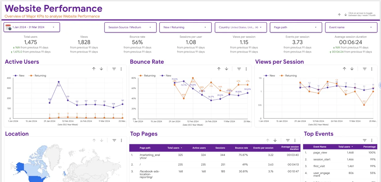
Heat maps are not only nice to have—they’re a powerful feature for business owners who are serious about website performance and user engagement. However, to fully understand and make moves on insights from heat maps, you need to pair them with Google Analytics dashboards. GA dashboards are a game-changer as they offer a broader view of how your site is performing. They empower you to track important metrics alongside visual data.
Need help building dashboards that align with your campaign or business objectives? Eaglytics Co. are data analytics experts, specializing in crafting tailor-made Google Analytics dashboards to meet your business needs. Get in touch with us today and let us take your business data insights to a higher level.


