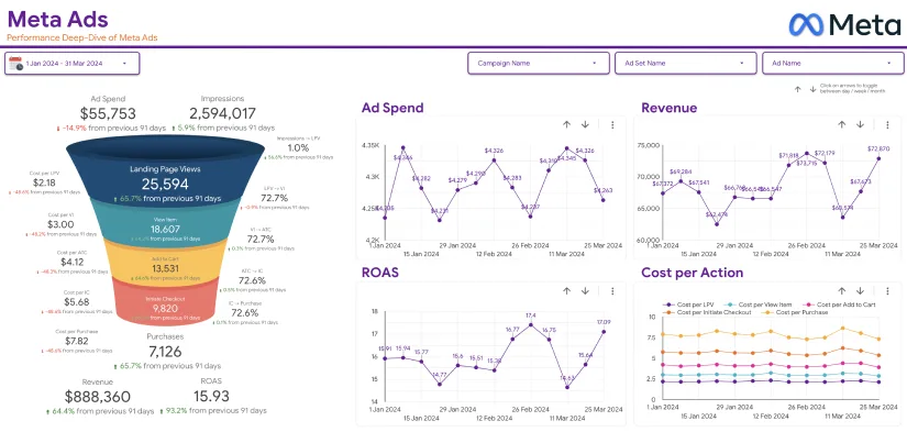
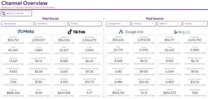
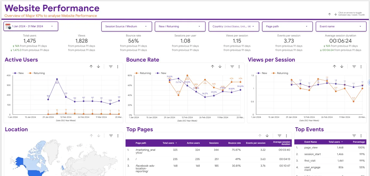
In today’s data-driven world, information is abundant, but it’s true value lies in how effectively it is visualized and understood. Whether you’re a marketer, business owner, or analyst, the ability to turn raw data into actionable insights is key to success. Google Data Studio is an incredible tool that helps you achieve this by enabling the creation of insightful and easy-to-read visualizations. In this Google Data Studio tutorial, we’ll guide you through the process of visualizing your data effectively, step by step.
What is Google Data Studio?
Google Data Studio is a free, cloud-based data visualization tool that allows users to transform raw data into interactive and visually appealing reports and dashboards. By connecting to various data sources such as Google Analytics, Google Ads, Google Sheets, and even third-party tools like MySQL and social media platforms, Google Data Studio provides you with the flexibility to create custom reports. These reports make data interpretation easier, encourage collaboration, and empower you to take action based on meaningful insights.
Why is Data Visualization Important?
Before diving into this Google Data Studio tutorial, it’s essential to understand why data visualization plays a pivotal role in modern analytics. Simply put, it simplifies complex data and makes it digestible. By transforming raw data into visuals, you can:
- Highlight Key Insights: Spot trends, patterns, and outliers quickly.
- Improve Decision-Making: Make data-driven decisions with confidence by presenting information in a more comprehensible format.
- Enhance Communication: Share findings with stakeholders using clear and visually engaging reports.
- Increase Engagement: Allow your audience to interact with your data, leading to deeper understanding and engagement.
Now, let’s walk through the process of using Google Data Studio effectively to create visualizations that will power your business decisions.

Step 1: Setting Up Your Google Data Studio Account
To begin your journey with Google Data Studio, the first step is setting up an account. If you already have a Google account (e.g., Gmail), you can use it to log into Google Data Studio.
- Visit Google Data Studio: Head over to the Google Data Studio website.
- Sign In: Sign in using your Google account credentials.
- Create a New Report: Once you’ve logged in, click on the “Create” button and select “Report.”
Step 2: Connecting Your Data Sources
Connecting your data to Google Data Studio is the next important step in building your visualizations. The platform allows integration with various data sources, including:
- Google Analytics
- Google Ads
- Google Sheets
- Social Media Platforms (via connectors)
- MySQL Databases
- Google Search Console
Let’s walk through the steps of connecting your Google Analytics data as an example:
- Click on “Add Data”: In your new report, click the “Add Data” button.
- Select Google Analytics: Choose Google Analytics from the list of connectors.
- Authorize Access: Log into your Google Analytics account and grant Google Data Studio access to your data.
- Choose Account and View: Select the specific Google Analytics account and view from which you want to pull data.
- Add Data: After making your selections, click “Add” to connect the data to your report.
Step 3: Creating Visualizations
Now that your data is connected, it’s time to create visualizations. Google Data Studio offers a wide array of chart types and widgets to display your data in a meaningful way. Here are a few options:
- Time Series Graphs: Track metrics like website traffic over time.
- To create a time series graph: Click “Add a Chart” and select “Time Series.” Customize the data and time frame (e.g., daily or weekly).
- Bar and Column Charts: Compare data across categories (e.g., traffic sources).
- To create a bar or column chart: Select either “Bar Chart” or “Column Chart,” then customize the dimensions and metrics.
- Pie Charts: Show the proportion of data, such as traffic distribution across channels.
- To create a pie chart: Choose “Pie Chart,” select your dimensions (e.g., traffic source), and adjust labels.
- Tables: Present raw data alongside key metrics.
- To create a table: Choose “Table” and add the relevant dimensions and metrics (e.g., “Date” and “Sessions”).
This part of the Google Data Studio tutorial, would really be helpful to visualize your data.
Step 4: Customizing Your Dashboard
To make your reports stand out and align with your branding, Google Data Studio offers a variety of customization options:
- Themes and Styles: You can modify colors, fonts, and backgrounds to match your branding.
- Interactive Filters: Add filters such as drop-down menus or date selectors, allowing users to explore data from different perspectives.
- Scorecards and Metrics: Use scorecards to highlight important metrics like total sales or bounce rates.
- Images and Logos: Add logos or images to personalize your reports further.
Step 5: Sharing and Collaborating
Once your Google Data Studio reports are ready, it’s time to share them with stakeholders:
- Share via Link: Click the “Share” button and select “Get Link.” You can choose to make the report accessible to anyone with the link or restrict it to specific people.
- Embed on Website: To embed your report on your website, select “Embed,” and copy the HTML code to insert into your site.

Step 6: Analyzing Your Data
One of the most significant advantages of Google Data Studio is the interactivity it provides. After setting up your reports, you can explore your data in real-time, filter variables, and dive deeper into specific metrics. Whether you’re tracking marketing campaigns or monitoring web traffic, this level of interactivity is invaluable for extracting actionable insights.
To gain more knowledge beyond this Google Data Studio tutorial and visualize your data, you can take help from reputed agencies.
Empower Your Business with Eaglytics Co.
At Eaglytics Co., we provide data analytics solutions that enable businesses to make smarter, data-driven decisions. From e-commerce analytics to optimizing app user experiences and refining digital marketing efforts, our services help businesses unlock their potential. With a team of global experts and a customer-first approach, we turn complex data into actionable insights that drive growth. Partner with Eaglytics Co. to revolutionize your business through the power of analytics.
Conclusion
In this Google Data Studio tutorial, we’ve shown you how to connect your data sources, create custom visualizations, and share insightful reports that help you make informed decisions. Google Data Studio is a powerful and free tool that makes it easier to interpret your data and communicate it effectively. Whether you’re a marketer, business owner, or analyst, learning how to use Google Data Studio will help you turn raw data into valuable insights. Start using Google Data Studio today and harness the full potential of your data!


