Learning Google Data Studio is crucial for marketers, advertisers, and other online business owners. GDS is a reporting and visualization tool. We find it intuitive and hard to learn. Many users rank Google Data Studio’s learning difficulty between 2 and 2.5 on a scale of 5. Its complexity level on a scale of 1 to 5 is mid-way. Thus, anyone who is determined to learn GDS can do it. If we compare GDS to similar tools, it is easier to understand. To begin learning GDS, follow this guide to know what to expect.
Google Data Studio – What is it and what does it do?
You have seen the term Google Data Studio just now. You have heard about it but have never bothered about it. Google’s Data Studio is one of the most popular and free data visualization and reporting tools. Since its inception in 2016, GDS has become a tool that most data analysts and marketers cannot live without.
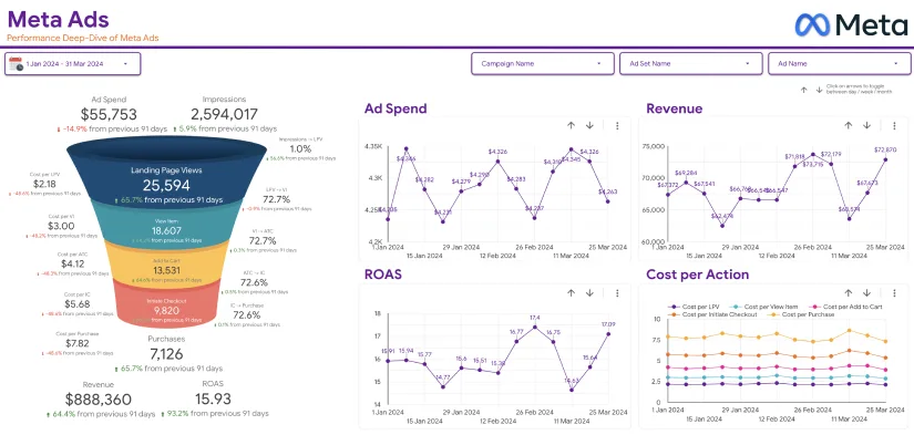
If you cannot afford Power BI or Tableau, you can opt for Datastudio Google com because it is free. Before using either of them, you can compare Tableau and Google Data Studio to determine which one is best for you. You can create sleek and professional-looking dashboards with GDS. Once you create them, you can share them with your team members or clients. As it comes with pre-made templates, Google Data Studio can be fun to use after learning it.
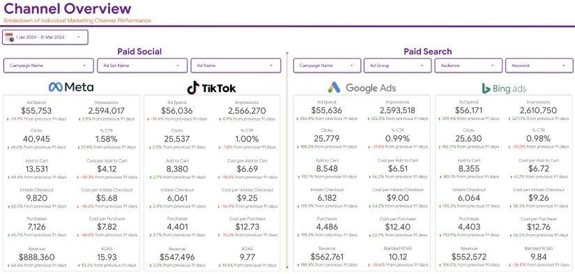
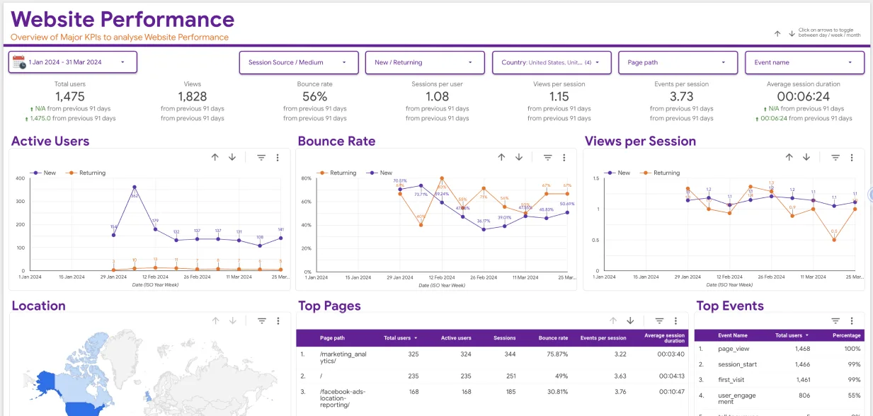
Also, it arranges and presents data in several types of charts. It has many data sources, allowing you to analyze your ads performance on Facebook, YouTube, Google Analytics, Google Sheets, etc. The Google Ads attribution reports allow you to bring customers insights and track down your advertising efforts. Once you sign in using your Google account details, go to datastudio.google.com to see the home screen.
Learning Google Data Studio – What modules are there?
Frankly, Data Studio is an extensive system with many modules. Anyone offering a course in GDS will break it down into many milestones that are easy to grasp. In this Data Studio Google tutorial, we will outline some of the crucial things to learn and put to effective use.
Home Page or User Interface

We have mentioned how you get to the home page or user interface of GDS. Every time you want to use this Google Data Studio tutorial, you will visit the user interface first. So, it is crucial to learn its features.
Left menu – A major thing you will create with GDS is a report. It will contain charts and other vital elements of your data. You must extract data from a data source and use the Explorer to navigate GDS. These functions appear on the left menu. The same menu will display the reports others have made and sent to you and those you have made or replicated from other users. Any deleted reports appear here too.
- Toolbar menu – To see all your reports simultaneously, choose the toolbar menu. It shows all the data sources you work with and all the charts. From here, you can alter a chart without affecting your report.
- Search bar – If you want to look for a given report, move to the search bar area. Write the name of the report and click to find it.
- Report list – If you want to sort all reports according to the owner, name, or last opened, move to the Report list.
- Template Gallery – If you want to make a new dashboard, you need to use a template. So, move to the Template Gallery at the top-right edge of your screen. Choose a ready template from the GDS team or choose a blank one.
Learning Google Data Studio is easy after mastering the Menus we have explained above. The next thing your teacher will talk about is Google’s Data Studio data sources.
What are data sources in GDS?
Before creating a report in Data Studio, you need to make a data source. To do that, you require a data connector and a dataset. A dataset can be a Google Sheet, a YouTube channel, a Facebook page, or any platform hosting your data.

So, to link GDS with your datasets, you need a data connector. The selected data connector will help you make a data source that will manage any information related to that connection. If you deal with a broad team, make as many data sources, as necessary. That also means you can use many data connectors.
As of now, you can access over four hundred data connectors and over eight hundred datasets. Additionally, you can choose third-party connectors when you cannot use free ones from Google. You can use these connectors to access your datasets from Twitter, Facebook, LinkedIn, Paypal, etc.
Metrics and Dimensions in GDS
Another crucial module when learning Google Data Studio is metrics and dimensions. These enable you to create insightful reports. When you apply an aggregation function like Sum or Average, you get a metric. It is just a value for counting or measuring. In contrast, dimensions are traits that describe metrics. A metric can be a minimum sale, a maximum sale, an average price, the number of customers who bought an item, sales revenue, etc.
When considering a metric like the sales revenue from selling an item, a dimension can describe the sales period, the type of order, the country of origin of most customers, etc. The minimum sales metric’s dimension can be the day of the week. The average product metric can have a dimension like the product type.
Making a dashboard in GDS
One of the main things you encounter when learning Data Studio is how to make a dashboard. The dashboard will help you and others view your online sales. The dashboard should contain a scorecard showing the total sales. It should also have a table with sales based on different product categories. Also, a line chart will help display how much you have sold under each order type. Your instructor will show you how to create all these items.
Adding a Google Sheet to GDS
Most people now use Google Sheets instead of Excel sheets. Thus, to add the data you have there, you must know how to add a Google Sheet to GDS. So, access the GDS home page and click on Create and then Data Source. Follow instructions to complete your GDS account setup.
Next, you will view the page with data sources. On this page, choose Google Sheets and click Authorize button to help GDS connect to your GS for the first time. Select a file in your Google Sheet and give it a name. Finish by clicking Connect.
Creating a blank report in GDS
Another imperative lesson you will get when learning Google Data Studio is how to make a new report. It is essential because you will use GDS multiple times to make reports. So, open the data source page and choose Create Report. It is in the top right area.
Data Studio will give you an option to add a new data source to the blank report. To confirm this, click on Add to Report. You will then see a random table that will contain the fields in your GDS. You can delete this by choosing Delete on the menu. Click on Untitled Report and write a new name for it.
You can give it a name based on the purpose of the report you are creating. Next, use various reporting tools on the interface. Shift to the top right side as that is where these tools are. If you click the View button, you will see the Edit Mode and View mode. You can alternate between these until you are happy with the appearance of the report.
On the three dots menu, there is a Refresh button and a Make a copy button. Other options are Add a Page, Selection Mode, Undo, Redo, Add Data, Add a Chart, Community Visualization, Components, etc. There is so much you can do before finishing your report. Under the Theme and Layout section, choose themes and layouts that Google has already provided.
Adding a Scorecard to a report in GDS

Another lesson when learning Google Data Studio is how to add a scorecard. You can think of a scorecard as having the same purpose as a title. It highlights something about a report. So, click on Add a Chart button on the toolbar and then choose Scorecard.
Next, drag the scorecard to the top left corner of the report. By default, it will read Record Count. So, move to the first column of the default metric and stop when a pencil icon appears. Click to activate a pop-up for editing the metric. Add a new name and click outside the pop-up box to end the task.
If the number appearing in the new metric is too huge, use the Compact number under the Style tab to alter it. Once you do, the small figure will appear more realistic to a client or whoever will get your report.
Adding a table to a report in GDS
Remember you removed a default table earlier. Now you can add a table that depicts your needs. So, click Add a chart button in your toolbar. Select Table and drag the ProductCategory into Dimension. Now choose ascending or descending order to enhance the appearance of your table.
Conclusion
As you can see, there are several things you will encounter when learning Data Studio Google tutorial. Many of these are not in this article. As you continue to learn, ensure that your online business is running smoothly by ordering GDS templates from us. Our team has created perfect templates for several businesses and they are here: https://eaglytics-co.com/products/.


