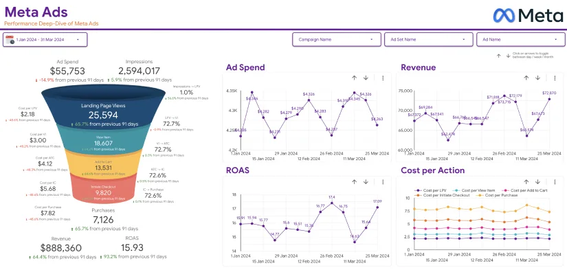
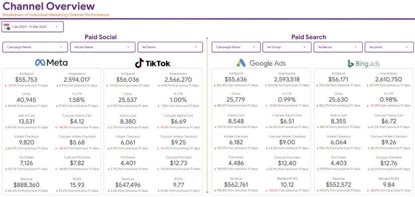
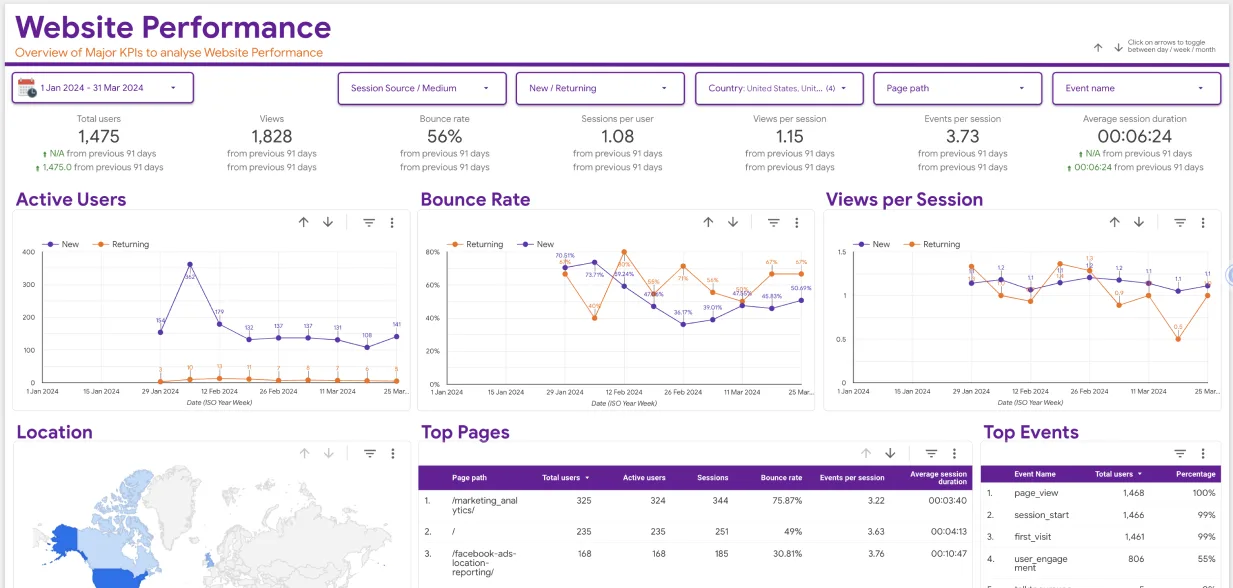
Creating marketing funnel dashboard on Google Data Studio is one of the many tasks you can do to understand your customers’ buying behaviors. Before making a purchase, buyers use different paths. Some use a shorter route and others a longer route. Also, some of those who view your e-Commerce website do not ever come back. To improve your advertising campaigns and track sales using Google Data Studio, you need to identify the touchpoints that customers meet before making a purchase at your online store.
By doing so, you can see who chose to exit the journey and who pursued it to the end. In this guide, we will talk about funnel visualization in Google Data Studio. We will show you how to make Google Data Studio dashboards when the customers’ conversion procedure is long and you want to monitor their behavior at every stage. You should also know that Data Studio lacks a direct way of creating marketing funnel visualization. That is why we want to help you create marketing funnel dashboards to see the flow of your customers and their shopping behaviors before converting.
Benefits of making conversion funnels
With simple funnel visualization dashboards and charts, you can monitor and analyze user interactions that lead to purchases or site subscriptions. The chart can classify various stages that users pass through before deciding to buy or quit. It will also present a logical sequence of hits and misses. In short, it will show you where the users who decided to leave went. The step-by-step visualization is so vital to marketers who intend to investigate customers’ touchpoints. By creating marketing funnel dashboard on Google Data Studio, you can redesign your advertising campaigns to target your customers better.
Creating Marketing Funnel Dashboard on Google Data Studio
As a user of Google Data Studio, you should be excited to know how to make a marketing funnel dashboard on it. Assuming we have a website already, we will use our funnel to view the conversion rate of the site for 90 days. Again, we will assume that we have six metrics we would like to track and monitor. These are:

- Site clicks – By this we mean the quantity of times that visitors have clicked on our website link
- Impressions – Here we will seek to know the number of times that our web pages became visible in the search engine results
- Sign-up stage 1 – We will track users who finished the first phase of joining our website
- Sign-up stage 2 – We want to know those who finished the second phase of signing up
- Sign-up stage 3 – The sum of users who completed the entire sign-up process and became basic plan members.
- Upgrades to Pro plan – We want to know the number of visitors who decided to spend on a Pro plan.
Google Data Studio creates beautiful bar charts and Scorecards. So we will use these two when creating marketing funnel dashboard on Google Data Studio. When setting up this in GDS, follow these steps:
Step One: Sign in on Google’s Data Studio
- To create a new report, log on to your GDS account first. Then, click the Blank Report.
Step Two: Add data to the blank report
- You will see a pop-up named Add data to report. So, choose the source of your data. Different data sources can connect directly to GDS. Let’s assume our data source is Google Sheets.
- So we will choose the specific data file we want and choose ADD. The file fields should appear on a data panel on the right.
Step Three: Add a chart
- The next step to take when making a marketing funnel dashboard is to add a chart. So, choose to Add a chart and then hit the Horizontal Bar chart icon.
Step Three: Insert a Chart
- Select Add a chart and click on the Horizontal Bar chart. This creates a chart.
Step Four: Insert Dimensions and Metrics
- When it comes to adding Dimensions, you must choose how you want to group your data. We will group it by month in this context and assume that our data represents April, May, and June.
- Next, when creating marketing funnel dashboard on Google Data Studio, we have to add the six stages we mentioned above as our metrics. We will follow a consecutive order when adding these metrics. So Site Clicks represents the top of our funnel, followed by Impressions and the rest.
Step Five: Edit your Bar chart

- Before you learn how to create professional marketing funnels, you will have to modify your charts a couple of times.
- So, move the cursor to the right side of your screen and select Style. Alter your chart to improve its appearance. To illustrate, you can convert its horizontal bars into vertical ones or change the color of each bar by choosing Color by.
- If you want to show the numbers of your chart, then click on Show data labels.
Step Six: Come up with formulas for ratios
- The next step in how to create your google data studio marketing funnel is computing ratios. You can create Data Studio ratios via a feature called Calculated Fields. To create these Data studio dashboard fields, move to the bottom of the data panel located on the right side. Then, click on ADD A FIELD.
- Name your new field and come up with a formula. For instance, find the ratio of Site clicks to Impressions
- It will give you the number of users who found a site URL on their Google search results and clicked on it.
- Save the newly-made field and choose DONE. Continue to build more ratio formulas per stage in this funnel.
Step Seven: Insert and Design Scorecards
- When creating marketing funnel dashboard on Google Data Studio in this step, you must display the conversion funnel rates with a Scorecard. And to do this you have to insert the scorecard first.
- Move to Add a chart again and choose Scorecard with Compact numbers.
- GDS will give the Scorecard a random metric by default, which you can change. So, drag and drop the month field to the Date Range Dimension of the Scorecard. Its location is the DATA panel.
- Now to make the Scorecard show the first ratio we made earlier (Site Clicks to Impressions), move to the DATA panel. Next, drag and drop the Site Clicks to Impressions ratio as another Metric.

- Click ADD A FILTER and make a filter. Name your filter for re-use in the future. For instance, you can name it Apri-filter to filter to the April month. Go to Select a field and click Month. Then under conditions, choose Checks and type April. Click Save. Just as you made a filter for April, you can make others for May and June. When creating a sales funnel in Google’s Data Studio in the future, click ADD A FILTER and then the Filter picker. Here you can find all the filters you made previously.
- Ensure that the metrics appear as percentages in the Scorecard. So, shift to Resources and then choose Manage added data sources.
- Choose EDIT Connection that corresponds to the data source. Some calculated fields will consist of the “fx” icon. Alter their Type to Percent.
Step Eight: Drag the Scorecard on the Bar Chart
- Place the Scorecard over the bar that shows the number of clicks for April. Then, re-size it via the Style panel for the Scorecard.
- You can also alter the label color or its size. If you choose to, you can Hide Metric Name.
- Check how your new chart looks like now.
Step Nine: Insert other Scorecards
- Next when creating marketing dashboards in DS, you should repeat Step Seven as we explained it. Every time you want to add a Scorecard, follow those easy instructions.
- Remember to select the suitable filter based on the month you want to display on your Scorecard.
Simplifying the process with a funnel graph connector
Google Analytics is a good analytics tool, but it is not sufficiently reliable. When you need analysis-ready data, you need a better data connector for your funnel graph. When selecting the best connectors, consider one that is easy to set up and start using. Also, make sure it can offer real-time data transfer so you can work productively.

Still, the tool has to be complete and accurate in terms of infrastructure. Above all, it should have in-built connections to hundreds of data sources. We have found some tools that suit this description best. These are Hevo, Demystified, and True-Metrics. So please check these out if you are a professional data inspector. Additionally, you can use a connector to pull data from Adobe Analytics and add it to Google’s DS. Choose a community connector gallery that most people trust and use often.
Conclusion
We have now shown you how creating marketing funnel dashboard on Google Data Studio works. And you can do much more than this to make your Data Studio more versatile. For instance, you can add segments from your Google Analytics to a funnel chart in your GDS. A segment in Google Analytics represents a subset of data. So, it can be customers from a given region or country.
Creating dashboards will directly depend on your marketing metrics and KPIs. It does not have to happen in the exact way we have explained in this article. You can quicken the process by choosing the Hevo connector or any other, as it will give you data for analysis in real-time. Are you ready to create dashboards on GDA? We hope you are and will enjoy the steps.


