Are you wondering how to use Google Data Studio which is now rebranded as Looker Studio? Don’t worry! In this blog, we’re going to share step by step guide on how to use Google Data Studio (Looker Studio) and some advanced features for both novice and intermediate users.
If you do not know Google’s Data Studio or Looker Studio, it is a free digital analytics and visualization tool. GDS has many features that are easy to understand and use. Besides, it enables users to collaborate, share, or schedule attribution reports.
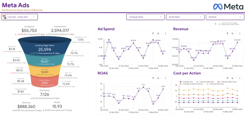
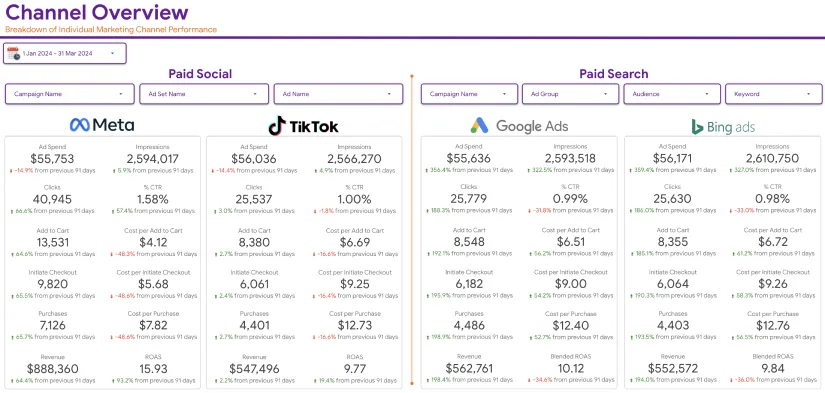
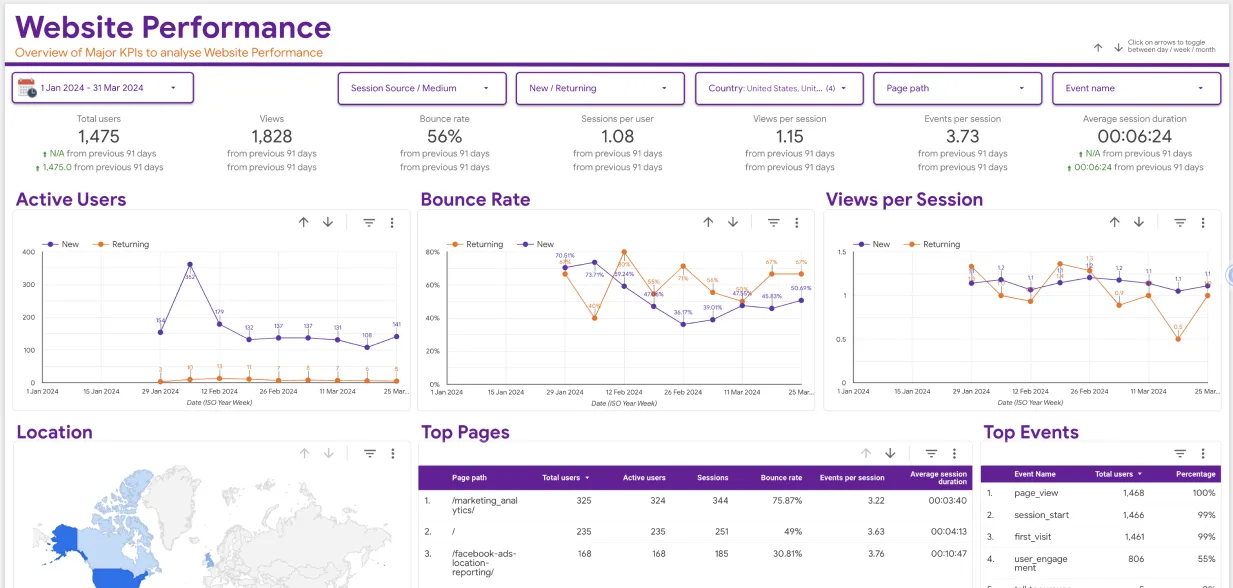
Data Studio enables users to import data from YouTube Analytics, Google Analytics, Google Sheets, Adwords, and BigQuery. Once done, you can view the information you have gathered in the form of tables, graphs, charts, and diagrams. It is one of the best tools for professional marketers who want to track the success rate of their digital marketing campaigns.
You can use Google data studio with minimal training because its dashboards are idiot-proof. There are also plenty of templates for making your work easier.
Advantages of using Google Data Studio
Why should you use GDS? What are the benefits of doing so? Besides getting data visualization and frequent reporting from GDS, it has the following benefits.
- It is an unpaid tool you can use to trace social media, PPC, organic SEO, and other forms of online marketing
- It provides live data connectivity and access to more than two hundred and forty integrations
- You can customize your report and other elements as you please
- The tool offers advanced formulas like calculated fields and metrics.
- Ease of sharing
- There is a Report Gallery with plenty of free-to-use templates and dashboards.
- Data studio connects with Mailchimp, Facebook, Adrol, and most other top digital platforms
How to use Google Data Studio
When it comes to using GDS, there are many tutorials online. But the tutorial that will shed light on this matter is right here. So keep on reading to know how or where to start. So, do the following:
Step One: Create a Google Account and Log into it
As earlier noted, this is a freely –offered tool. Thus, anybody with a Google Account can begin using Google data studio. Again, if you have been using data from Google Analytics, or the Google Ads account, you are a step ahead of others. Once you are ready with a new account, visit the Home tab to see your dashboard.
Step two: Take a look at the Data Studio Dashboard

The dashboard will look familiar to you if you have used or use Google Sheets, Google Docs, or Google Drive. It has the following features:
• Reports – If you need reports about PPC, SEO, and other things, you can access them here. It has different capabilities to make your work easier. For instance, you can filter your reports by Owned by Me, Shared with Me, and All. Also, you can place some items in the trash bin if you do not need them.
• Data sources – This one is a list of all the connections or integrations you have made between Google Data Studio and other sources of data you have. The digital analytics tool offers more than five hundred data connections. Top examples are:
• Google Analytics
• Google Ads
• Google Search Console
• PostgreSQL
• BigQuery
• Search Ads 360
• YouTube Analytics
• Display and Video 360
Step three: Use the Explorer tool
To start Using Google Data Studio, you should get familiar with the Explorer tool. For instance, you can build a table in this program that represents the best landing pages based on their lead conversion rate. To see how it would change, if you introduced a new metric, what of using the Explorer tool? So, export your table or chart into Labs and start tweaking data. If you decide that it is good enough, place it back into the report. We will explain that below.
Step Four: Check the Report Gallery
Next on how to use Google Studio is checking the Report Gallery. Here there is a vast collection of templates and illustrations. We will talk more about this step below.
Step Five: Add data sources
You have the freedom to connect to data resources with the report, or you may add directly. Here is how you can do it. You are going to see Connect to Data on the dashboard. Although there might be slight differences, the process of adding data to a report is similar. So, we shall add Google Analytics because it is so popular:
• The 7 Google’s Data Studio will prompt you to add the Google Analytics Demo Account. So, authorize the connection and then select an account, property, and view. Next, click Connect, which is in the upper left-hand area of your screen.
• Then, check a list of each field in the Analytics account. You will see the fields you have added and also the standard fields. Note that you should leave “Field editing in reports” showing “On”. However, you can leave it “Off” if you still want to have control over your data after giving your client permission to edit the report. In this step, there are things you, as the manager, can do to the data. For instance, you can add new fields and duplicating the existing ones. However, you should edit your data here if you wish to because you can find the task easier within the report itself.
• Next, click on Create Report on the upper right side
• When Data Studio prompts you to add a new data source to the report, accept it. Next, click on add a chart which is in your toolbar. This will help you compare and contrast different chart types and include illustrations too.
• So, select Time Series, as the first option there is to see changes over time. Once you view it on your report, check the right-hand area to see how it appears now. Although the main dimension appearing here is the Date, convert it to Hour, Day, and Year.
• Google Data Studio automatically picks a metric that appears on the Y-axis of a graph. If you do not like what it chooses for you, alter it to what you want to view. But how can you add a metric? There are two ways of doing it. First, you can click the blue +sign icon to see a search box. Next, enter the name of the field you need in this box. Alternatively, drag the field from the right side and drop it into the metric section. If you are unhappy with the newly added metric, you can delete it by clicking the white X symbol that pops up.
• To add a table, you want to select the third option. Then click Style to access the style tab. Scroll it down until you see Add border shadow. To see the completed item, choose View in the top corner area. You will now operate in the Viewer mode.
• All along, you have been working on a report that has no name. So to name it, click Edit and then double click on the title. Type the name you want to give it, and that is it.
• Share your report by sharing the icon right above the Chart Editor, enter an email address.
Tips of using Data Studio features as a novice
a) Templates
There are tons of freely offered templates on GDS. You can use these as a starter because they are easy to understand. So, tour the Report Gallery. If you want to use those templates that the GDS team created personally, visit the Marketing Templates section. The Community section also has more than forty-five templates that users have submitted. The most popular template is the Paid Channels Mix Report showing how ads are doing on different social media pages.
There is also the Website Technical Performance Indicators template. It entails the summary of your site’s page load time and other performance indicators in real-time. There are many more, so explore them slowly. You can also check our customized Google Data Studio templates which are made to help marketers quickly visualize their marketing data and make smart decisions.
b) Publish the report
Once you finish making a report, ensure that you publish it so that your teammates can view it. If you want to share it publicly on Facebook or elsewhere, remove sensitive data. A public statement should be impressive, so use your designing talent fully. You can even add a video of yourself and other captions to enhance your public report. After that, share it via a Google Form.
c) Connect data from different sources
One benefit of using GDS is the ease of importing any data source into it. We mentioned some of these sources above. There are hundreds of these, so it is hard to miss the one you often use. Whether you use AdStage, AdRoll, Adobe Analytics, or Asana, choose the correct data connector.
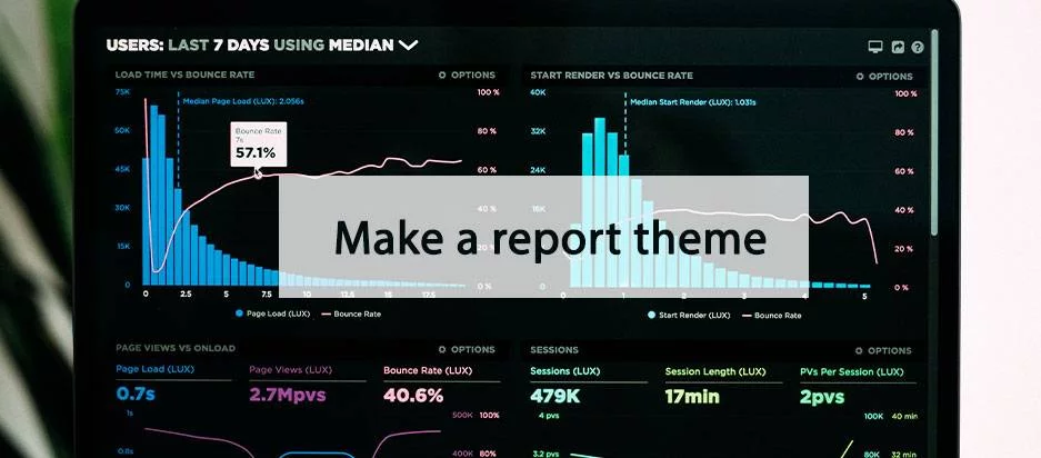
d) Make a report theme
It does not matter who you intend to give the report to. The item has to look great. So you need to make a theme that can make it unique via the Layout and Theme icon on the toolbar. Even if Data Studio provides only two themes (Simple and Simple Dark), use your designing knowledge to make another. Click the Current Theme drop-down and select Custom then create your own customized Google Data Studio theme utilizing your brand’s colours.
To simplify your work, design the theme with the help of HubSpot or Raleway. The GDS software lacks flexibility, and these two can help. While at it, create many custom charts and ensure that you alter the border and background settings. Note that the changes you will make here will reflect everywhere on the report. Thus, you can avoid repeating the same styling actions each time you add a module to the report.
e) Embed external content
You can insert anything here, including a YouTube video, Google Sheet, or Google Docs. It is even possible to attach a live web page. To add the content you want, hit Insert in the upper navigation bar and select URL Embed just below Pivot Table. To fit the whole length and width of the URL, resize the box and finish. As you are doing all this for your target audience, make it lively.
f) Send scheduled reports
If stakeholders want to see your reports, you can send them some. The Scheduled Report on GDS is a crucial tool when you must produce recurring reports. Enter the recipient’s email address first and then decide on a timetable to follow. So, will you send reports every day, week, two weeks, or month?
g) Downloading reports
In addition to sending reports, you can alternatively download them in the form of a PDF. Downloading is not necessary unless a customer would like to see a report. So, click the downward-facing arrow which appears next to a clock. Still, you download the whole current page or select pages you would like to have. It is up to you.
h) Embed reports
If you want, you can display the report on your portfolio or website. This is when you want to emphasize the results you have managed to get for your client or boss’ project. Therefore you should click this icon: <> in the upper navigation bar. A box with an option to Embed Report or Embed URL link will show.
Tips to use Google GDS as an intermediate user
After doing all the above, you can continue to the next step on how to use Google Studio as an intermediate. Note that you need proper training to be able to proceed. Otherwise, you have to hire an expert to help you. Here is what you can do:
Add a date range
Besides scheduling when you can send reports on Data Studio, you can as well add a range of dates. In short, you can give your viewers a chance to select the dates they want to see your reports. You can set a default date range, like thirty days. It is possible to choose yesterday, the last seven days, and so on. Additionally, users can select a custom period. First, go to the page where you want to give users the ability to control dates. At the same time, ensure that you are now in the Edit mode rather than the Viewer mode. Click on the calendar icon located on the toolbar. You will see a box appear on the report. So, drag this box into the upper right or left side corner so it can be easier to locate. The location you will select will then have a Date Range Properties option.
Alternatively, set this to the Auto date range, which is the default. When viewers choose a date with the newly set data range properties widget, each report on the page will automatically show that particular time interval. If you wish to override this, then you should set a time within a certain chart. After that, the period in the preselected chart will always displace the default date range control. Another way is to pick the group of charts that will automatically update if a person adjusts the date range. However, update your viewers about this change immediately.
Add filters
Another point on how to use Google Data Studio entails adding filters. To give your viewers more control and flexibility, add some filters, each filter will have settings that will automatically update in each report. You can resize and adjust a filter before dragging it into the area you want. If someone selects it, a panel will appear on the left-hand side. Viewers can filter via any dimension from your data source. Metric is not mandatory and they cannot filter the content by it. They can also Search All filters with numeric or phrases with different operators. However, the most common is greater than, less than, equal to, and so on. In all, the list filter is easy to use.
Create an interactive chart filter
As an intermediate, you can manage to create interactive chart filters in your reports. These will be responsive chart filters and you can create them by first choosing a dimension in a chart. Hence, all the charts on the page will filter for the selected dimension. Still, it is possible to create time, area charts, and line time controls.
Add data controls
This is among the best features in the GDS software. You can place data controls on your reports to help viewers select the source of the data pipeline that is entering your charts. They will choose view from the data source drop-down menu and the charts will populate at once. Hence, you can avoid making the same report severally to suit the needs of each group. Also, a single report can have several data controls and enable the primary source of information you want viewers to pull it from.
Use Google Data Studio Advanced Features
At an advanced level on how to use Google Data Studio, there are complicated features you can use too. They include the following:
Make report-level filters
By default, a filter will apply to each chart on the page. If a viewer moves to the next page, the filter will remain? If you are not a technical director, you may not agree with this. To move the filter up from page-level to the report level, right-click on it and choose to Make report level. Come up with blended fields – Google Data Studio is powerful because there are more than 400 sources of data you can add into one report. The blended fields bring even more benefits.
To capitalize on this, you want to utilize SQL knowledge. That is why this is an advanced feature as you need familiarity with JOIN clauses in SQL.
Blending the data source with itself
In learning how to use Google Data Studio, you will encounter the GA data connector. It will let you add one active user metric to a chart. As a result, you cannot see 1 Day Active Users, 7 Day Active Users, and 28-Day Active Users on one chart. The only way to avoid this is to blend Google Analytics data source with itself.
Create a calculated field
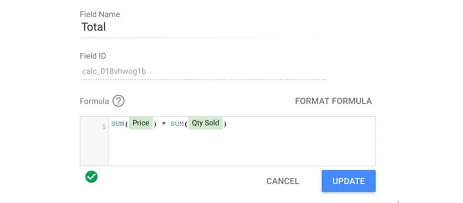
When your existing data does not provide adequate information, you can make a calculated field. When calculated fields pick up your data, they do calculations on them. You can make a field that runs on a data source level as it will make that field available in any report that uses that source. However, you require edit rights to the original information. Another way is to build a chart-level field so that you only use the field for that report alone. Here you do not need any edit rights to the original data.
Make a data-source calculated field
Simply click on Add a new field on the lower left-hand side. Alternatively, click the pencil that appears next to the data source and then choose to add a field in the upper right corner of your field menu. Follow easy instructions on how to use Google Data Studio to achieve your goal.
Make a chart-level calculated field
All you should do is click Add a Field under the existing dimensions and metrics you have selected. Enter a formula for the new field by typing in the name of the desired metric to see options. Then click Apply.
Making an advanced calculated field
When RegEx and functions come into the picture, you should come up with a field. These will be easier to create if you already know how to use Google’s Sheets or Excel spreadsheet. To transform a source into all upper-case, utilize the UPPER function. Just hit Add Dimension >Create new field.
There is so much more you can do at an advanced level when using Google Data Studio than we can explain in this guide. OWOX BI Pipeline is also a tool that can help you gather information from different services at once. However, you should link the Google Analytics data pipeline to OWOX BI. When you want to add cost data from CRM systems to BigQuery with OWOX BI, choose an advertising platform like a social media page. We now hope that you can use Google Data Studio well following the easy steps on this file. You can use it for marketing attribution when you want to adjust and enhance advertisement methods.