Does getting the hang of Looker Studio feel like playing Tetris in hard mode and wondering whether there are Google Data Studio tips and tricks to get you by? At Eaglytics Co., our main focus is on building custom reporting dashboards for data analysis and monitoring. Through the years, we’ve gathered a handful of tricks and hacks through research and our own experience. We’re glad to help concur the mountain of Google Data Studio in your path to marketing success.
With these never-seen Google Data Studio tips and hacks, you’ll learn how to harness the platform like an expert. You’ll discover how to turn those tangled datasheets into sleek interactive reports. Want to visualize your website metrics or perhaps build dashboards for presentation, we’ve got your back!
What’s Google Data Studio?
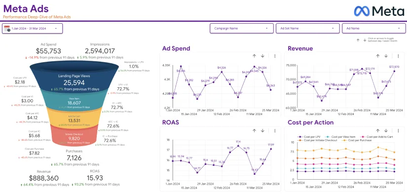
Google Data Studio, now Looker Studio, is a data visualization tool that can turn raw data into insightful, interactive dashboards and reports. The name Google Data Studio has remained stuck even after it was renamed to Looker Studio on October 11, 2022. As a business intelligence (BI) tool, Looker Studio offers a lot of features like beautiful presentation layers, integration with data sources, and the powerful LookML modeling language.
You’ll find these features way superior compared to what other BI tools in the market, such as PowerBI, SAS, and Tableau have to offer. Plus, Looker offers a pleasant training environment that you can leverage to master the platform’s basics.
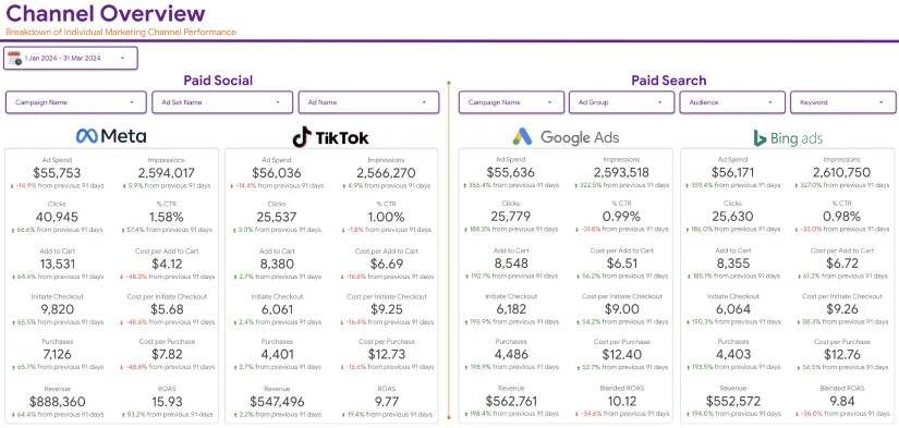
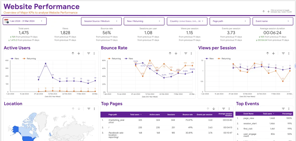
Whether you want to track website performance, monitor ad campaigns, or pull data from multiple sources, Looker Studio makes it easy for you to present the data visually. It also includes features like drag-and-drop, dynamic filters, and custom charts to make your insights accessible and actionable. That means you don’t need to have coding skills. Most importantly, it’s available free of charge, making it an essential tool for data experts and pros alike.
Top 10 Google Data Studio Tips and Tricks

In the last two years that Google Data Studio became Looker Studio, we’ve been busy developing insightful dashboards in Looker. Through this, we discovered useful Google Data Studio tips and tricks that might benefit anyone using the platform. Some of these tips are simple, but they may be pretty new to you. So, let’s get started and help you work with Google Data Studio more efficiently than ever before.
1. Use Advanced Data Blending
Structured Query Language (SQL) is a commonly used language among data architects and analysts to join different tables in databases. If you run a small business with a limited recruiting budget to hire such specialists, you might think advanced data analysis isn’t for you. Surprisingly, Google Data Studio makes it possible to leverage high-level data analytics, even if you know nothing about SQL.
Through the platform’s drag-and-drop features, you can do almost everything experts can do without writing a single code line. You can combine data from different sources, say, Google Ads and Google Analytics, into a single report. Think of it like making the perfect smoothie—you get the best of everything in a single blend. Check out Google’s guide on how to blend data.
2. Leverage CASE function
Want a more effective way to sort or organize huge chunks of data? Make use of the sophisticated CASE function, a handy feature for creating conditional logic in your reports. If you know how the “IF-ELSE” logic in programming works, it’s the same thing with CASE.
The function lets you customize data dynamically by specifying conditions. For instance, you can create a new field that assigns a label “High,” “Medium,” or “Low” based on how your sales perform. Its syntax is pretty straightforward too:
CASE WHEN condition THEN result ELSE other_result END
The function returns the first result matching the expression after evaluating the conditions. If no condition is met, it allows you to set a default result. Let’s look at a simple CASE function example:
CASE
WHEN Country IN (“USA”, “Canada”, “Mexico”) THEN “North America”
WHEN Country In (“England”, “France”, “Germany”) THEN “Europe”
ELSE “Other”
END
3. Leverage Community Connectors

When your marketing campaign stretches to other platforms like Facebook, X, or your CRM, you don’t have to limit yourself to Google data. Make use of Community Connectors to source data from any other platform that Google doesn’t provide a connector for.
They offer seamless connectivity to Google Data Studio, with the freedom to go wherever your data lives. Supermetrics are some of the connectors that you can use to seamlessly connect to your data sources.
Simply create a new data source in Google Studio, then scroll down to Partner Connectors. Authorize the connection and choose the connector you’d like to use.
4. Use Drill-Down Dimensions
This is one of the most important Google Data Studio tips and tricks that took us some time to discover. But since then, we use it now and then. It comes in handy, especially when you want to offer more information without cluttering your reports.
Drill-down dimensions enable viewers to click through metrics to reveal more granular details. Think of them as peeling an onion, layer by layer, but without the tears. Check out Google’s guide on how to create and use drill-down dimensions.
5. Multiple Page Reports
Google Data Studio allows you to create a report to display several data types. Now, imagine doing that using Microsoft Word when creating a report with a couple of pages. It’s cumbersome.
In Data Studio, you can create multiple pages to keep your data well organized, without much hassle. For example, you can create a page for website traffic, another for audience demographics, and a third one for ad performance. This allows your audience to navigate through the insights without feeling overwhelmed with information overload.
Use the “Add Page” button to create pages and label them clearly for data storytelling. If you want to maintain the format, simply duplicate the pages. Additionally, viewers can easily switch between the pages with just a single click.
6. Use Data Range Filters
Data range filters are highly important features for marketers and analysts since they have to deal with huge datasets. Filters are also important for your audience to adjust the timeframe of the data they want to see—whether it’s daily, weekly, or monthly. They make reports interactive, allowing users to explore the trends and identify patterns over specified periods.

For example, marketers can switch between Q1 and Q2 data without the need for multiple reports. Simply drag and drop a date range filter onto your working canvas, and connect it to the appropriate chart. And voilà, you’ve created a more flexible and insightful report.
7. Create Custom Calculated Fields
This Google Data Studio tip is all about using formulae (calculated fields) to directly generate new metrics in Looker Studio. They employ branching logic to allow you to use geographic data and texts, as well as do data evaluation.
For example, if your dataset doesn’t have conversion rates, you can create a formula to calculate it. The outcomes of calculated fields are displayed for every data row. Depending on where they’re put, calculated fields can either be data-source-specific or chart-specific. Click here to learn how to generate a new metric with calculated fields.
8. Take Advantage of Parameters
Parameters are another important feature that every marketer or data analyst would want to use to avoid repetitive work. They’re placeholders that let you key in values dynamically to create more interactive reports. For example, you can create a parameter for custom date ranges or currency conversion.
Check out Google’s guide on how to create parameters on Google Data Studio.
9. Embed Reports on Existing Templates
This is one of our favorite Google Data Studio tips and tricks we use to spice up reports. Let’s say, for instance, you need to insert real-time reports from Google Sheets, YouTube, or other platforms. With the help of the URL embedding feature, you can do it with ease.
This comes in handy when you want to enhance the accessibility of your reports. It’s a magical hack that works wonders for marketing reports and internal dashboards that need to be shared without a hassle.
10. Experiment with Data Studio Community Templates
Google Data Studio community has plenty of creative templates you can experiment with to find one that resonates with your audience. So, don’t stress yourself trying to reinvent the wheel—make use of what’s already provided for free to make your work easier.
It’s A Wrap!
We hope with these Google Data Studio tips and tricks under your belt, you’ll be able to generate functional and fabulous reports. Data Studio ensures your data can speak louder than words, whether you’re presenting to a C-suite exec or simply tracking your campaign metrics.
Remember, data may narrate the story, but how you craft and present it makes the biggest difference. Plus, the best way to remember these Google Data Studio tips is by doing. So, go ahead and give them a try.
If you don’t have the time or know-how, or simply have too much on your plate to handle, let Eaglytics Co. help you with your Google Data Studio needs. Get started today and open a new chapter on how you view and interact with data.


