Creating javascript visualizations in Google Data Studio must not be a problem if you have ever authored a visualization in JavaScript. In this article, we will learn how to create custom Javascript visualizations in Google Data Studio.
Let us start with knowing what Google Data Studio, Javascript, and Google Data Studio community visualizations are.
What is Google Data Studio, and how does it work?
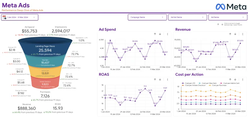
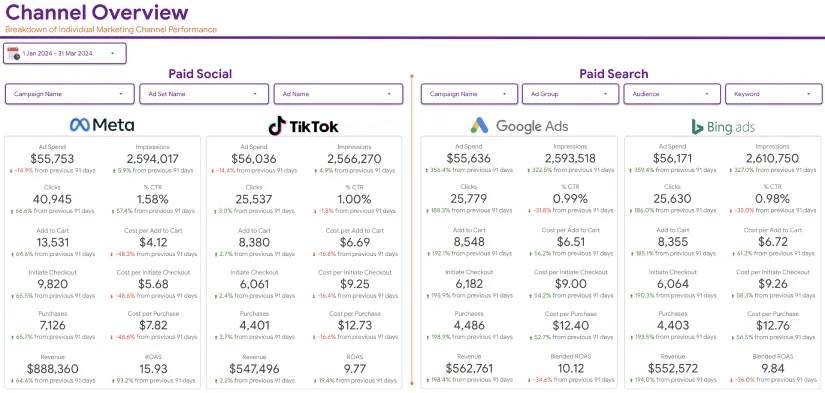
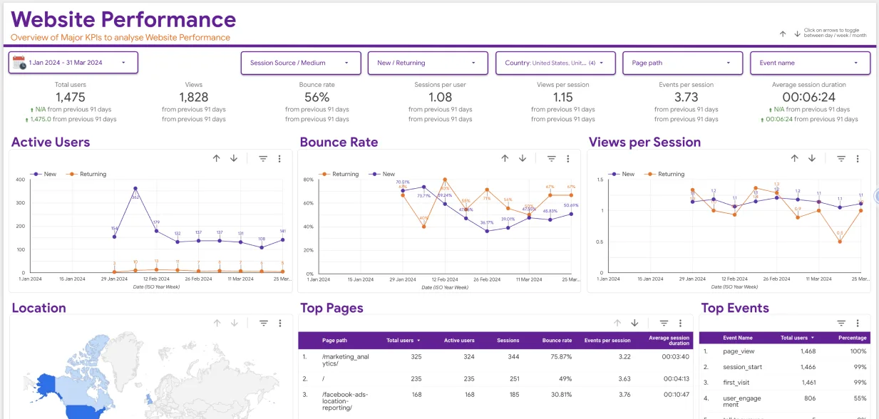
Data Studio, from Google, is a free app for transforming data into customizable insightful reports and dashboards. It was released in 2016 as one of the Google Analytics 360 enterprise packages. Google released a free edition of the Data Studio platform for individuals and private teams in May 2016. Google Data Studio is a free tool that allows users to create live dashboards with stunning data visualizations. Data may be retrieved from a wide range of sources, and reports can be created using Google Data Studio with complete editing and sharing options.
What is Google Data Studio Community Visualization?
Google Data Studio Community visualizations are third-party charts that interact with your data and may be set similarly to Google Data Studio’s standard charts.
In Google data studio, community visualizations enable us to create and use our custom javascript visualizations. Others can use your community visualizations together with their data if you share them with them. Even though the community visualization does not have direct access to your data.
Using Community Visualization
You may now go beyond the conventional charts included with Google Data Studio with this new functionality. Custom JavaScript and CSS can be rendered into a component that connects with all your Google Data Studio interface using community visualizations.
- Create a limitless charts variety using JavaScript frameworks and community visualizations
- Distribute these bespoke charts to users inside your business
- Display any information that is already within your dashboard (or external stakeholders)
End users can engage with a custom visualization through the Google Data Studio UI in the same way they would with any chart. They can, for example, update data fields and style settings without having to go back to the code. The following is an example of how this works.
What is Javascript, and How Does it Work?

Web pages that do more than simply show static information are typically built using JavaScript. – displaying timely content updates, interactive maps, dynamic 2D/3D visuals, scrolling video jukeboxes, etc. There are three layers of default web technologies that we have already explored in depth: HTML, CSS, and JS. JS is the third layer. In other words, Javascript is a type of programming or scripting language that may be used to construct complicated features on web pages, such as animated 2D/3D visuals, interactive maps, sliding video jukeboxes, etc.
Creating javascript visualizations in Google Data Studio
This process will require storage buckets on Google’s cloud platform to store the following files.
Here are the files –
- manifest. json
- myViz.json
- myViz.js, and
- manifest.json
The manifest must have a name, but the rest of the files can have whatever name you choose. The only requirement is that you include their location or names in your manifest file.
Next, we will create the javascript files needed to build a visualization of the community.
- After downloading and copying the Google Data Studio Community Component library (DSCC) to your working directory, you are ready to use it.
- In a text editor, paste code and then save it myVizSource.js in the working directory.
- MyVizSource.js and the visualization auxiliary library should be concatenated into a single file, either by transferring the information of the two files into a new file or by using the following instructions to concatenate both files.
- Next, save myviz.css as myviz.css by copying the code.
The CSS file specifies how your visualization should look. Then, save myViz.json as myViz.json by the code.
At this stage of Creating javascript visualizations in Google Data Studio, we will create a bucket cloud storage project.

Step 1: You must build a Google Cloud Platform project.
Step 2: Set up a GCP bucket in your account.
Step 3: The section after buckets is where you will want to keep track of the name of your bucket and the journey it takes to get there.
The initial “ID” is the component’s unique identifier in Google Data Studio, and this will be used to identify and deploy it.
Step 4: Save the code as manifest.json after copying that into a text editor.
Your visualization resources and location can be found in the manifest file’s resource component. We must provide the files for the bucket path, and we can move them into your bucket as needed.
In our next step, we will run our community visualization through Google Data Studio.
Step 1: In Google Data Studio, create a new report and name its blank report
Step 2: We are going to choose our Google Sheets connector
Step 3: use the direct technique by uploading the data set to Google Drive.
Step 4: Click on community visualization found in the toolbar.
When you click on this, a drop-down menu will appear.
Step 5: Explore more in the drop-down menu by navigating the community gallery shades in the drop-down menu.
Step 6: Choose “create your own visualization”.
Step 7: Input the prefix “bucket” before “manifest-path” in the text input box and click “submit.”
One visualization card should appear because of this.
Step 8: Add visualization to your report by clicking the visualization icon.
The color selector style elements can be used to modify your visualization in the next step. The code should be substituted for the existing code within your myVizSource.js file.
- It is time to merge the javascript files.
- Your visualization files should be re-uploaded to Google Cloud Storage
- Test your community visualization by refreshing the Google data studio report.
- Finally, we will present the data here as a bar chart.
- MyVizSource.js should be replaced by the code.
- Then, create a javascript file with the merged code.
- Your visualization files should now be stored in Google Cloud Storage.
- Test your community visualization by refreshing the Google data studio report.

Google Sheets data should be used to build a bar chart containing labels. A CSS style and a title are the final steps in creating javascript visualizations in Google Data Studio thus far.
- MyVizSource.js should be replaced using the code.
- Next, build a javascript file with the combined code.
- Your visualization files should be re-uploaded to Google Drive.
- Test your community visualization by refreshing the Google data studio report.
Bar charts with titles produced from the data & decorated using myViz.css should appear.
Making Google Data Studio Community Visualizations More Accessible to the Public
It is time to include a data source in your dashboard now that you have added the visualization. This may need some fine-tuning before it works as expected. Using a data source that cannot articulate with these resources will result in a faulty visualization. The data source parameters for the data source you want to use should be opened. It is important to know about data source identities in Google Data Studio if you do not see the administrator-level permissions for a database.
Enabling Community Visualization access in the data source is required for this.
Here is how –
- A data source can be added by clicking into a Visualization.
- Verify the data source’s ownership
- The source of our information in this case is a Google Sheet.
- Find the pencil icon beside your data source to see if it belongs to you.
- Modify the source data.
- Locate the on/off switch for Community Visualizations.
- Turning on access to community visualizations in the settings > Save.
Google Data Studio’s Custom Visualizations in the Future
It is great to watch how Google Data Studio is being adopted and contributed to by a variety of various businesses and communities as it continues to grow in popularity. For digital marketers & organizations who are used to delivering dashboards and reports, it’s a no-brainer, but the user-friendliness and intuitiveness of this dashboard and report tool are attracting new industries and users. For dashboard designers, personalized visualizations may be small, but are enormously powerful tools for filling in the gaps left by default reporting tools. Attracting new users while also evangelizing changes to current and previous users is made easier when there is a thriving and lively community of contributors. Do not see what you are looking for, or want to try something new? Create and share a new visualization.
Conclusion
Creating javascript visualizations in Google Data Studio is this simple. You can try it out for yourself. To get the most out of your dashboard, you can begin by incorporating the features you need, and as you become more comfortable, you can experiment with additional options. It is never too late to start creating your Community Visualizations. At Eaglytics, we are encouraged by the growing commitment to transforming reports into compelling, data-driven tales because of the Community Visualization adoption. You can check out some of the best Google Data Studio templates we created for your convenience.


