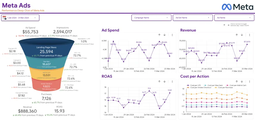
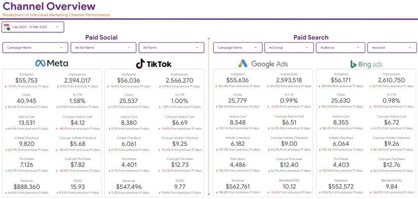
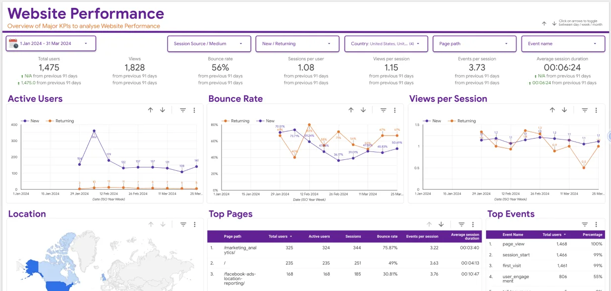
Do you want to know how to create a Google Data Studio theme using your brand’s colours? Well, you have come to the right place. We will tell you how to use Data Studio to create new themes based on images.
‘Picture is worth a thousand words. We have all heard this adage several times. This stands true for data presentation, too. With time, data presentation in a visual format is becoming more popular. People are more inclined to creating data dashboards that appeal to the audience visually. Not only are these easy to navigate but also easier to read. Visually attractive data dashboards are being used by all industries.
Google Data Studio has lots of benefits. One of the top reporting tools comes with many interesting features, such as allowing you to brand your dashboards. So, you can create visually attractive data reports even without any technical know-how or training. Yet if you’re completely new to Google Data Studio you can head over to this Google Data Studio beginner’s guide.
Now, let’s find out how to use your brand’s colours for creating Google Data Studio theme.
Steps to Create a Google Data Studio Theme Using Your Brand’s Colours
Before we move on to the steps, you should know to use the color consistently and meaningfully in building your reports that are easier to understand and attractive. The style and color can be applied to different parts of the report, including the page, text fonts, chart borders, and so on. It is also possible to apply brand colors to the data elements.
Now, let’s dive in to get an idea about how to create a Google Data Studio theme using your brand’s colours.
1. Decide on the Colour Palette
Firstly, you will have to decide on the colour palette of the brand image you would like to work with. The colors can be applied to the static elements, as well as data elements. Now, you can start using data studio to create the theme.
2. Look for a Data Studio Report

Once you know the colour palette that will be used for the digital theme, you must look for the template that you want to customize. If you choose a report from Google Analytics, you will notice it displays the Default theme that any new report features in Data Studio. However, you will have to align the report with your brand’s colors.
3. Draw Color Theme from Brand Logo
When you choose the extract button, you are given two options- to upload the image from the system or link to the URL of the image over the internet.
You might think my logo is already done. Since you already have your logo, you will have to the former option. As soon as you have chosen the image, Google Data Studio will analyse it thoroughly to extract the primary colours on the logo.
Now, we will talk you through the process to use the image to extract the theme.
In the Edit Mode, you will find the Theme and Layout on the right-hand side of the default menu. In case you don’t find this in the Edit Mode, you might already have the widget selected. Just click on the report’s blank section to open the menu. You will find a list of themes displayed in Data Studio. Check out the Layout and Theme tabs that you will find in different themes available. Click on the ‘Extract theme from image’ option to match it with your brand’s image colour. Look for the option on the bottom right corner of the screen.
After it is done with the analysis, it will give you three themes to select from. Use color themes you like and click on Apply.
In case you haven’t built the widgets, play around with some charts and you can create a Google Data Studio theme using your brand’s colours. In case you have created a report already prior to adjusting it with the theme, you will find the new visuals come through.
4. Selecting the Right Theme

You have three different themes at hand. So, you must be careful with the choice you are making. All three will have same colour combinations. But you must choose the right one to create a google data studio theme using your brand’s colours.
Choose a theme just by clicking on it. Once you do, it will become your custom theme.
5. Fine Tune the Theme
Google Data Studio gives you the option to further customize the design and colours of the theme. This is mainly to ensure that it matches your brand colors perfectly.
If you are not happy with the elements of the new theme or want to include some other colours to integrate.
The customized theme keeps the report in line with the colours of the brand. It makes your brand’s marketing analytics visually interesting. The themes are not final, and you can make changes whenever you want. Go over to the ‘Theme and Layout’ once more to choose ‘Customize’ given alongside the theme you are using. Click on it to open the options you have.
The Edit Theme menu will provide you with a range of features in the theme, including the component backgrounds, text style, link colours, and Chart Palette.
Don’t forget that the Chart Palette needs to be based on the image you have chosen to create your theme. Simply click one of the color palettes for clicking on the respective square. Choose a new colour from the menu or add a custom colour.
The colour menu comes with a Theme section that shows the colours present in the theme palette. Hence, you can select these to work on your dashboard in no time.
6. Make Data Stand Out
People tend to ignore a monochromatic data page as it looks monotonous and bland. It might appear like you have changed nothing. If you set up reports that are attractive and are in accordance with the brand identity, it can really make a difference. Your audience will start perceiving the data report in a different light. Thus, they will engage with the data report and process more information.

Remember, to build your brand recognition, you must present your data through visually attractive images. It should look nicer.
Bottom Line
Google Data Studio can make your data stand out. There are many who have setup their business around making reports and statistics stand out. With all data at hand, you can easily customize it with your Google Data Studio and lay them in a visually appealing manner. Google Data Studio has several uses.
Data analytics have become highly crucial in recent times. It can help the managers and the owners understand the progress of their business and what must be done to make it more successful.
To retain their customer base, businesses turn to analytics. And attractive data visualization can deliver data in the most effective manner. It is one of the effective steps you need to take if you are running a business. Data visualization collates raw data and models to deliver information and reach a conclusion. With data visualization, it becomes easier to interpret and understand data.
We need to understand that our brain isn’t well-equipped to devour so much unorganized or raw data and convert it into something usable. And there can be nothing better than using the Google Data Studio to do this. Use it to create a google data studio theme using your brand’s colours and make data visually appealing.


